Hello! Today, we’ll delve deeply into ‘Theme Customization’, one of the most crucial elements determining Backstage’s user experience. 🎨
Beyond merely providing functionality, Backstage should be a platform that can project our company’s brand identity. While the default themes are excellent, changing the theme to match the company’s logo colors or design guidelines plays a significant role in enhancing developers’ sense of belonging. We’ll provide a complete, step-by-step guide to Backstage’s recommended theme customization techniques! 💡
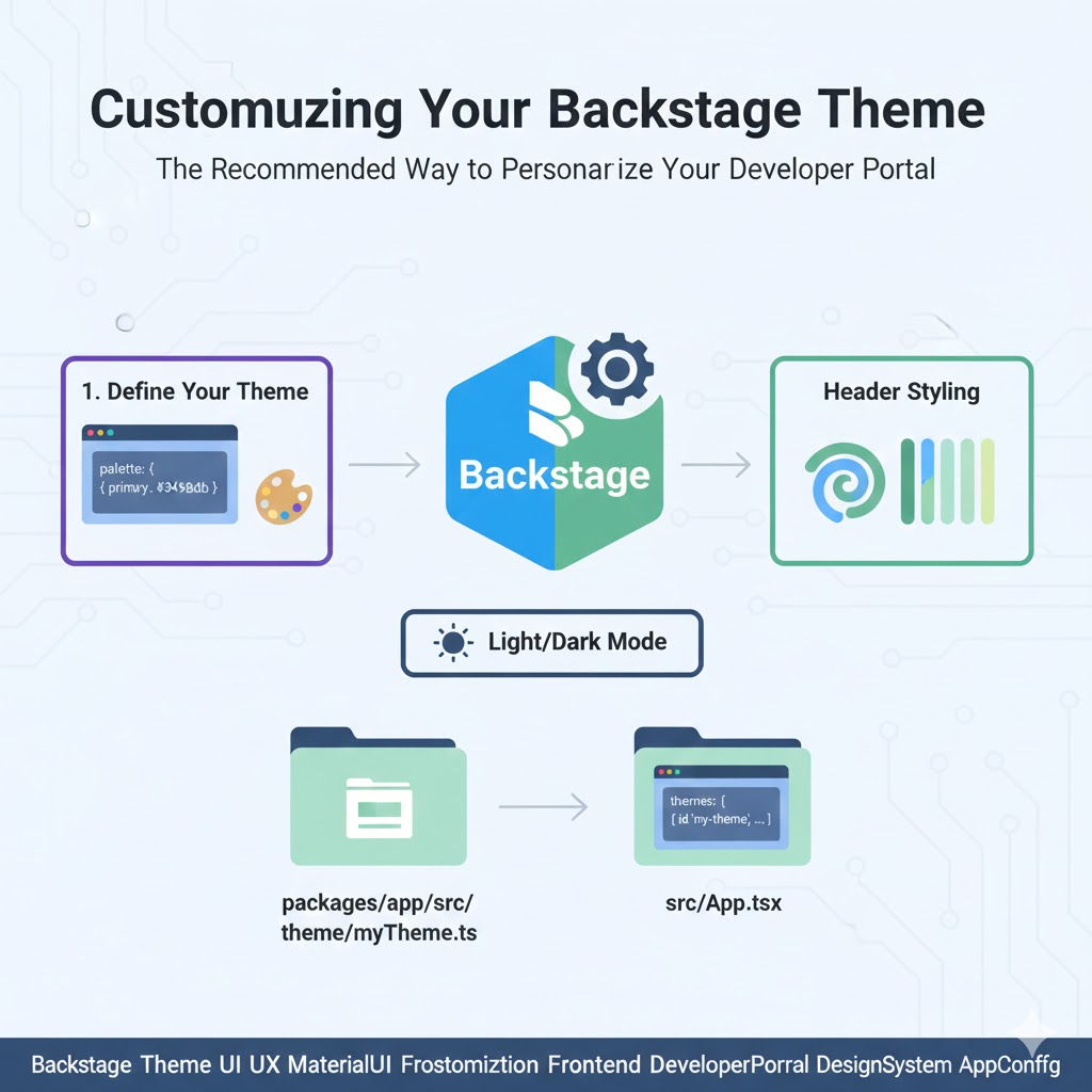
🏗️ Backstage Theme System Fundamentals: Material UI
Backstage’s UI is built upon Material UI (MUI). Therefore, customizing themes means utilizing MUI’s theme system.
Backstage offers broadly two levels of customization methods.
- Light/Dark mode switching and basic color changes
- Complete custom theme creation and application
🌟 Step 1: Basic Color and Font Customization (Recommended Method)
The most recommended method is to use the createUnifiedTheme function provided by Backstage. This function extends MUI themes to meet Backstage’s specific requirements.
✅ Key Configuration Items
- Palette: Specifies primary, secondary, and background colors.
- Typography: Sets font family, size, weight, etc.
- Default Page Themes: Defines Backstage’s unique header gradients, etc.
🛠️ Step 2: Applying the Code (Package: packages/app)
Theme work is done within the packages/app folder, which is the frontend application.
📝 Custom Theme Definition Example (src/theme/myTheme.ts)
TypeScript
import { createUnifiedTheme, themes } from '@backstage/theme';

export const myCustomTheme = createUnifiedTheme({
  palette: {
    ...themes.light.palette,
    primary: {
      main: '#3498db', // Our company's main blue color!
    },
    secondary: {
      main: '#2ecc71',
    },
  },
  fontFamily: 'Roboto, Arial',
  /* Additional header themes can be defined here */
});
📝 Registering the Theme in the App (src/App.tsx)
The defined theme must be registered with the createApp function in App.tsx.
TypeScript
import { myCustomTheme } from './theme/myTheme';

const app = createApp({
  apis: ...,
  themes: [
    {
      id: 'my-theme',
      title: 'Company Theme',
      variant: 'light',
      Provider: ({ children }) => (
        <ThemeProvider theme={myCustomTheme}>
          {children}
        </ThemeProvider>
      ),
    },
    // Existing dark themes can also be maintained.
  ],
});
🎨 Step 3: Page-Specific Header Theme Customization (Advanced)
Backstage provides functionality to vary the top header’s color or pattern based on entity type (Service, API, Website, etc.). This allows users to intuitively understand what kind of resource they are currently viewing.
- Shape: Selects geometric patterns for the header.
- Colors: Specifies color combinations to be used for gradients.
💡 Tips to Remember When Customizing Themes!
- Accessibility Compliance: When changing colors, always ensure sufficient contrast between text and background. ♿
- Maintain Consistency: All plugins share the same theme, so avoid colors that stand out on specific screens.
- Consider Dark Mode: Don’t just create a light mode! Developers love dark mode. 🌙
🏁 Conclusion: Themes are the Beginning of the Developer Experience
The core of Backstage’s recommended theme customization technique is to extend MUI themes via createUnifiedTheme and register them in the app’s themes array.
Using this method, consistent styles are immediately applied to all Backstage core components and plugins. Start designing your company’s unique developer portal right now! 🚀
Leave a Reply